How to Conduct Cohort Retention Analysis
- Amara James Moosa

- Apr 30
- 9 min read

Introduction
In marketing and customer relationship management, knowing how many customers you keep (retention) is as important as knowing how many you gain. Retaining customers is often more cost-effective than acquiring new ones. This article provides a practical approach to conducting cohort retention analysis and forecasting user retention using Python. We'll cover key concepts like ad spending, user acquisition, and churn, before diving into a step-by-step Python implementation. Finally, we'll discuss real-world applications and limitations of this forecasting method. Resources like AnalystsBuilder and DataCamp are recommended for those new to Python.
Cohort Retention Analysis: Fundamental Concepts
In paid marketing, businesses invest significantly to acquire potential customers. Understanding the relationship between advertising spend, lead generation, and user retention is crucial. This section defines key metrics for analyzing these relationships.
Key Definitions:
Spend: The total monetary investment in paid advertising campaigns.
Lead: A potential customer who expresses interest by providing contact information or completing a form.
Acquired Users: A lead who converts into a paying customer.
Churn: The termination of a paying customer's relationship with the business.
Active Customer: A paying customer who continues their relationship with the business.
Core Metrics for Analysis:
Cost Per Lead (CPL): Calculated as Total Spend / Total Leads. It measures the cost of acquiring a single lead.
Customer Acquisition Cost (CPA): Calculated as Total Spend / Total Acquired Customer. It measures the cost of acquiring a single customer.
Retained Users: Calculated as Acquired Customers×(1−Churn Rate). It represents the number of customers who continue their service within a given period.
Active Users: The number of customers who were active in the previous period plus the number of retained customers in the current period.
Acquisition Rate: Calculated as Total Acquired Customers / Total Leads. It represents the proportion of leads that convert into paying customers.
Churn Rate: Calculated as Total Churn / Total Acquired Customers. It indicates the proportion of acquired customers who discontinue their service.
Retention Rate: Calculated as Retained Users / Acquired Users. It represents the proportion users retained from those acquired.
Understanding these fundamental metrics is essential for accurately forecasting user retention and optimizing marketing strategies.
Python Implementation: User Retention Forecasting
This section provides a practical demonstration of how to forecast customer retention using Python. Our implementation will guide you through the essential stages of this process, including:
Importing necessary libraries: Setting up the Python environment with the required tools.
Loading data: Ingesting your customer data for analysis.
Visualizing trends: Exploring historical retention patterns through informative visualizations.
Generating retention forecasts: Applying forecasting techniques to predict future retention rates.
Calculating retention rate: To gain insight into the proportion of our user base that remains engaged over time. This metric provides a clear understanding of our ability to retain users.
Visualizing the cohort retention heatmap: to identify patterns and trends in user retention across different acquisition cohorts. This visual representation allows us to observe how user retention evolves over time.
For the sake of brevity and focus, we will not delve into every line of code within this post. However, the complete Python code is readily available below each section and has been thoroughly documented to facilitate your learning and practical application in your work.
Practical Cohort Retention Analysis:
To illustrate our analysis, we'll be utilizing a dataset that is highly representative of the kind commonly encountered by marketing and growth teams. This dataset encompasses key campaign performance indicators, with the following structure:
Date: This column indicates the specific month in which the marketing campaign concluded.
Spend: This represents the total expenditure allocated to the campaign during that particular month.
Acquired: This denotes the total number of new users successfully acquired as a direct result of the campaign's activities within that month.
To follow along, please download the datasets and follow with the Python codes below.
Download the dataset for this exercise
Date | Spend | Acquired |
1/31/2024 | 10,000 | 1,000 |
2/28/2024 | 10,500 | 1,050 |
3/31/2024 | 11,025 | 1,103 |
4/30/2024 | 11,576 | 1,158 |
5/31/2024 | 12,155 | 1,216 |
6/30/2024 | 12,763 | 1,276 |
7/31/2024 | 13,401 | 1,340 |
8/31/2024 | 14,071 | 1,407 |
9/30/2024 | 14,775 | 1,477 |
10/31/2024 | 15,513 | 1,551 |
11/30/2024 | 16,289 | 1,629 |
12/31/2024 | 17,103 | 1,710 |
Load the datasets and libraries.
Import the libraries and load the datasets for this exercise
Key Metrics for Analysis:
The first key metric we looked at is our Average User Acquisition. This tells us how many new users we get, on average. We calculate this by dividing the total amount of money we spent by the total number of new users we acquired.
Based on our data, our Average User Acquisition is 10 users, as illustrated below:
Total Spend: $159,171
Total Users Acquired: 15, 917
Average User Acquisition: 159, 171 / 15, 917
Our next question is: Is the company spending more on advertising month after month?
Code for plotting the campaign spend overtime
# Format 'Date' column to 'Year Month' (e.g., '2023-01')
Ads_df["Date_formatted"] = Ads_df["Date"].dt.strftime("%Y-%m")

# Define the plot
# Adjust figure size for better visual appeal
# Use a more visually appealing color
plt.figure(figsize=(12, 6))
ax = sns.barplot(data=Ads_df,
                 x="Date_formatted",
                 y="Spend",
                 color="#3498db")

# Format the chart title
plt.title("Campaign Spending Over Time",
          fontsize=16,
          fontweight="bold"
         )

# Format y-axis with currency and thousand separators
plt.ylabel("Advertising Spend (USD)",
           fontsize=14,
           fontweight="bold"
          )  # More descriptive label

# Labels as currency
formatter = ticker.StrMethodFormatter("${x:,.0f}")
ax.yaxis.set_major_formatter(formatter)

# Format x-axis
# Adjust ha for alignment and font size
plt.xlabel("Campaign Month", fontsize=14, fontweight="bold")
plt.xticks(rotation=45, ha="right", fontsize=10)

# Improve gridlines (or remove them for a cleaner look)
# Add subtle horizontal gridlines
ax.yaxis.grid(True, linestyle='--', alpha=0.6)

# Remove the unnecessary borders
sns.despine(left=True, bottom=True)

# Add values on top of the bars, formatted as dollars
# Format with dollar sign, comma, and no decimals
for p in ax.patches:
    ax.annotate(f'${p.get_height():,.0f}',
               (p.get_x() + p.get_width() / 2., p.get_height()),
                ha="center",
                va="center",
                xytext=(0, 10),
                textcoords="offset points",
                fontsize=10)

plt.tight_layout()
plt.show() 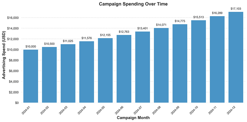
The chart shows a clear trend: the company is increasing its advertising budget. We can see that they are growing their ad spend by 5% every month. For instance, their spending went from $10,000 in January to $10,500 in February. To calculate this increase, we can do the following: ($10,500 / $10,000) - 1 = 0.05, or a 5% rise.
We also wanted to analyze the trend of our User Acquisition Growth. Are we consistently acquiring more users month after month?
Code for plotting the users acquired overtime
# Define the plot with improved aesthetics
# Adjust figure size for better aspect ratio
# Use a visually appealing color
plt.figure(figsize=(12, 6))
ax = sns.barplot(data=Ads_df,
                 x="Date_formatted",
			   y="Acquired",
                 color="#3498db")

# Format the chart title
plt.title("Users Acquired from Advertising Campaign",
          fontsize=18,
          fontweight="bold") # bold title

# Format y-axis with thousand separators and improved label
ax.yaxis.set_major_formatter(ticker.FuncFormatter(lambda x, p: format(int(x), ',')))
plt.ylabel("Users Acquired",
           fontsize=14,
           labelpad=10) # add padding to label.

# Format x-axis with clearer labels and rotation
plt.xlabel("Campaign Month",
           fontsize=14,
           labelpad=10) # add padding to label.
plt.xticks(rotation=45,
           ha="right",
           fontsize=12) # increase fontsize of xticks

# Remove unnecessary borders and add subtle gridlines
sns.despine(left=True, bottom=True)
ax.yaxis.grid(True,
              linestyle='--',
              alpha=0.5)  # Add subtle horizontal gridlines

# Add value labels on top of the bars
# Format with thousand separators
for p in ax.patches:
    ax.annotate(f'{p.get_height():,}',
                (p.get_x() + p.get_width() / 2., p.get_height()),
                 ha="center",
                 va="center",
                 xytext=(0, 10),
                 textcoords="offset points",
                 fontsize=10)

plt.tight_layout()
plt.show()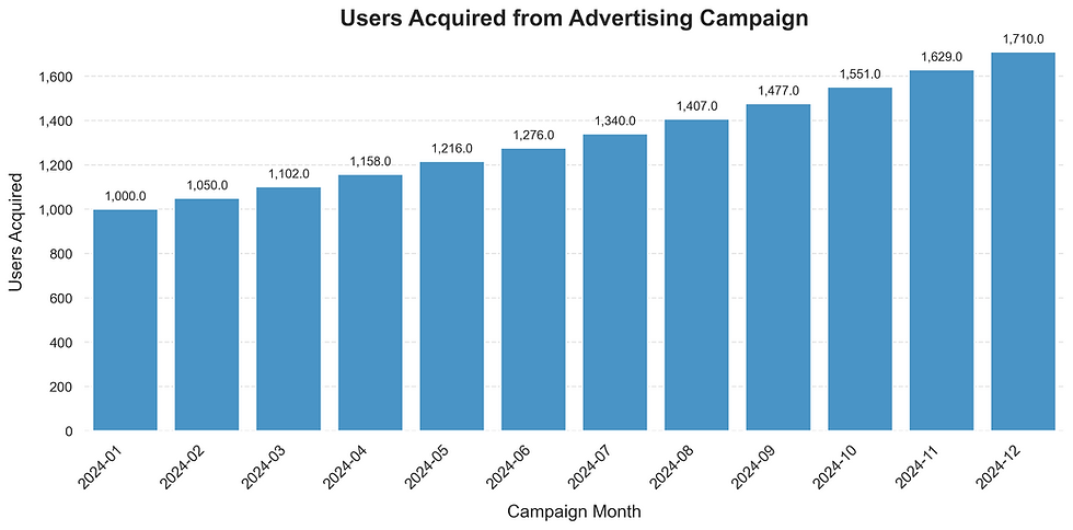
The chart above indicates a positive trend, with our user acquisition growing by approximately 5% each month. As an example, we acquired 1,000 users in January, and this grew to 1,050 users in February. This represents a 5% growth, calculated as (1,050 / 1,000) - 1.
To explore the potential link between this user growth and our advertising spend, we will now examine a scatter chart.
Code to create the scattered plot
# Calculate the correlation coefficient
correlation = Ads_df["Spend"].corr(Ads_df["Acquired"])

# --- Presentation-Friendly Plotting with Seaborn ---
# Adjust figure size for better readability
plt.figure(figsize=(10, 6))
sns.regplot(x="Spend",
            y="Acquired",
            data=Ads_df,
            scatter_kws={'s': 80, 'alpha': 0.7},
            line_kws={'color': 'red'}
           )

# --- Formatting ---
# Format Spend as dollars
plt.gca().xaxis.set_major_formatter('${x:,.0f}')

# Format Acquired with thousand separators
plt.gca().yaxis.set_major_formatter(mtick.FuncFormatter(lambda x, p: format(int(x), ',')))

# --- Labels and Title ---
plt.xlabel("Advertising Spend", fontsize=14)
plt.ylabel("Number of Users Acquired", fontsize=14)
plt.title("Relationship Between Advertising Spend and Users Acquired", fontsize=16, fontweight="bold")

# --- Include Correlation Coefficient ---
plt.text(0.05, 0.95,
        f'Correlation Coefficient: {correlation:.2f}',
        transform=plt.gca().transAxes,
        fontsize=12,
        verticalalignment='top',
        bbox=dict(facecolor='white', alpha=0.8)
       )

# --- Grid and Aesthetics ---
plt.grid(True, linestyle='--', alpha=0.6)

# Remove top and right spines for a cleaner look
sns.despine()

# Adjust layout to prevent labels from overlapping
plt.tight_layout()

# Show the plot
plt.show()
Based on the scatter plot, we can see a strong pattern: higher advertising spending leads to a higher number of users acquired. The correlation coefficient of 1 reinforces this, indicating a very close and positive relationship between these two factors.
With a clear understanding of how ad spend impacts new users, our next step is to predict monthly user retention. We'll calculate this by multiplying the number of acquired users by (1 - Churn Rate).
Code for forecasting the user retention values for each month based on their cohort date
# Subset of the dataframe for forecasting retention.
acquired_data = Ads_df[["Date", "Acquired"]].copy()

# Convert 'Date' to datetime objects.
acquired_data["Date"] = pd.to_datetime(acquired_data["Date"])

# Define churn rate.
# In real-world scenarios, calculate the actual churn rate.
Churn_Rate = 0.1

# Calculate retained users for each month.
retention_data = {}
for i in range(len(acquired_data)):
    acquisition_date = acquired_data["Date"].iloc[i].strftime("%Y-%m-%d")  # Use ISO format for consistent merging
   retention_data[acquisition_date] = {}
   for j in range(len(acquired_data)):
       retention_month =acquired_data["Date"].iloc[j].strftime('%b')
       if j >= i:
          retention_data[acquisition_date][retention_month] = round(acquired_data["Acquired"].iloc[i] * (1 - Churn_Rate) ** (j - i))
       else:
		  retention_data[acquisition_date][retention_month] = 0

# Create a DataFrame from retention data.
retention_df = pd.DataFrame(retention_data).T.reset_index()
retention_df.rename(columns={"index": "Date"}, inplace=True)

# Convert 'Date' column to datetime objects in retention_df
retention_df["Date"] = pd.to_datetime(retention_df["Date"])

# Merge acquired_data and retention_df on 'Date'.
acquired_retention_df = pd.merge(acquired_data,
                                 retention_df,
                                 on="Date",
                                 how="left")

# Display the resulting DataFrame.
acquired_retention_df
Understanding our monthly user retention rate – the percentage of users who don't churn – gives us a clearer picture of user loyalty. So, our next step is to convert the number of retained users into this informative monthly percentage.
Code to calculate retention rates.
# Make a copy of the retention dataset
retention_rate_df = acquired_retention_df.copy()

# Iterate through the rows and calculate retention rates.
for index, row in retention_rate_df.iterrows():
    acquired_users = row["Acquired"]
    for col in retention_rate_df.columns:
        if col != "Date" and col != "Acquired":
           retained_users = row[col]
           if acquired_users > 0:
           retention_rate_df[col] = retention_rate_df[col].astype(float) #ensure that the type is float.
retention_rate_df.loc[index, col] = (retained_users /           acquired_users)
            else:
                 retention_rate_df.loc[index, col] = 0.0

# Display the retention rate DataFrame.
retention_rate_df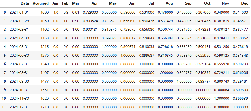
Our final step is to visualize our forecasted user retention rates using a heatmap. This will help us quickly identify which partners experience the biggest user drops and when those drops happen.
Code for visualizing the cohort retention in an heatmap
# Set 'Date' as the index and format to short month.
retention_heatmap_df = retention_rate_df.set_index(pd.to_datetime(retention_rate_df["Date"]).dt.strftime('%b')).drop(["Date", "Acquired"], axis=1)

# Create the heatmap with improved aesthetics
# Further increase figure size for better presentation
# Adjust annotation size
# Increase linewidths for clearer cell separation
# Improve colorbar
plt.figure(figsize=(14, 9))
sns.heatmap(retention_heatmap_df,
            annot=True,
            fmt=".1%",
            cmap="YlGnBu",
            cbar=True,
            annot_kws={"size": 11},
            vmin=0,
            vmax=1,
            mask=retention_heatmap_df == 0,
            linewidths=1,
            linecolor="white",
            cbar_kws={'shrink': 0.8, "label": "Retention Rate"}
           )

# Improve title
plt.title("Cohort Retention Heatmap",
          fontsize=18,
          fontweight="bold",
          pad=20
         )

# Improve x-axis label
plt.xlabel("Months After Acquisition",
           fontsize=14,
           labelpad=10
          )

# Improve y-axis label
plt.ylabel("Acquisition Month",
           fontsize=14,
           labelpad=10
          )

plt.yticks(rotation=0, fontsize=12)  # Improve y-axis tick labels
plt.xticks(rotation=0, fontsize=12)  # Improve x-axis tick labels

plt.tight_layout(pad=2)  # Add extra padding

plt.show()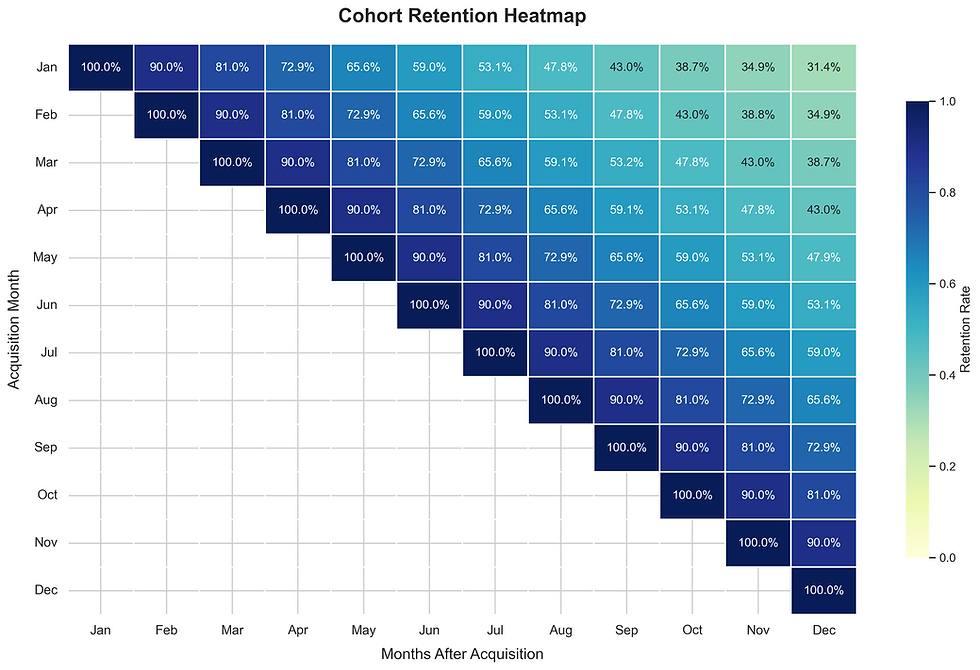
The heatmap highlights a key trend: the company retains only around 50% of its users in the initial five months after acquisition. This insight allows the company to develop specific user retention initiatives. By improving retention, they can make their customer acquisition efforts more efficient and cost-effective over time.
Cross Industry Application
Beyond the Obvious: How Churn Prediction Drives Smart Business
We often think of churn in terms of lost subscribers, but its predictive power reaches far wider, impacting core business functions across industries. By identifying at-risk users or customers, organizations gain invaluable insights to proactively improve engagement and retention.
Product teams leverage churn prediction to understand feature adoption, uncover unmet needs, and personalize user experiences, ultimately building stickier products.
In security, it helps providers retain clients and even flags internal disengagement with crucial protocols, enabling proactive risk mitigation.
Web-based businesses, from e-commerce to SaaS, use churn prediction to optimize conversion funnels and cultivate lasting customer relationships.
Sales teams can identify defecting accounts and at-risk leads, allowing for targeted outreach and more efficient resource allocation.
Ultimately, understanding who is likely to leave empowers businesses across all sectors to act strategically, strengthen customer loyalty, and drive sustainable growth. It's about moving from reactive firefighting to proactive relationship building.
Important Considerations
Understanding and predicting user retention is crucial for sustainable growth. However, extracting meaningful insights requires a thoughtful approach.
For cohort retention analysis, remember to:
Define cohorts smartly: Group users based on relevant factors beyond just signup date.
Choose the right lens: Select appropriate timeframes and key metrics that reflect your business.
Visualize for clarity: Make trends easily understandable with effective charts.
Focus on action: The goal is to understand why cohorts behave differently and what to do about it.
When predicting retained users, consider these vital points:
Data is king: High-quality, relevant historical data is essential for accurate models.
Model wisely: Select and rigorously evaluate predictive models that fit your data and goals.
Understand the "why": Aim to uncover the reasons behind churn risk for targeted action.
Integrate for impact: Predictions are most valuable when they trigger timely and relevant interventions.
Act ethically: Ensure fairness, transparency, and respect for user data throughout the process.
By keeping these considerations in mind, businesses can move beyond simply tracking retention to proactively fostering long-term user loyalty and maximizing customer lifetime value.
Conclusion
In essence, cohort analysis and forecasting provide a powerful lens into the heart of your user relationships. By tracking groups over time, you gain invaluable insights into long-term engagement and can proactively predict future retention. This understanding empowers you to make data-driven decisions, optimize user experiences, and ultimately build a more sustainable and thriving business. Investing in these techniques isn't just about analyzing the past; it's about strategically shaping your future success.


Very detailed analysis. Really love the Python implementation.